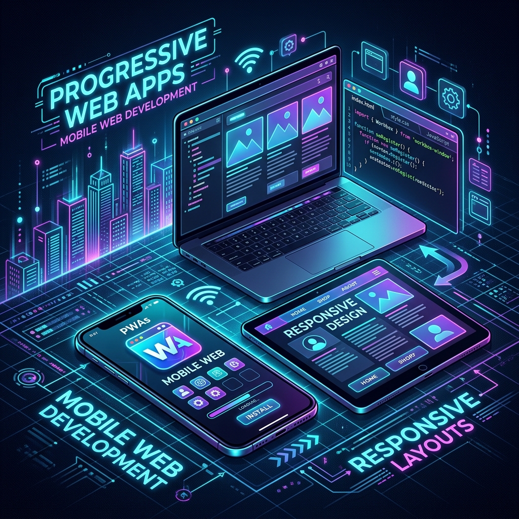
Mobile Compatibility and the PWA Revolution in Web Design: The Invisible Side of Speed and Conversion
In today's digital world, more than 70% of website visits occur via mobile devices. Search engines (especially Google) use the Mobile-First Indexing algorithm when evaluating websites. That means no matter how perfect your desktop view is, if your mobile experience is weak, you are destined to be invisible in search results.
However, today the concept of "mobile friendliness" does not just consist of boxes shifting downwards when you narrow the screen. Now, websites challenge the performance and user experience of native mobile applications (Native Apps). The most powerful actor in this transformation is PWA (Progressive Web App) technology.
So, what engineering details lie behind the scenes of turning a standard website into a true mobile powerhouse and crowning it with search engine optimization (SEO)? In this article, we will touch on the invisible technical secrets of mobile transformation in web design that your competitors overlook.
1. Is Mobile Friendliness Just About "Responsive" Design?
Many web developers and agencies think that adding a few media queries to the CSS file and narrowing the site is enough for mobile friendliness. However, this is just the tip of the iceberg. Real mobile compatibility requires the functions that work on desktop to run with zero friction on mobile as well.
Let's take a closer look at some critical points encountered in corporate and complex web projects that directly reduce SEO scores on mobile:
A4 Document and Reporting Pages Perfection on Mobile
Invoice, proforma, or report pages designed with physical dimensions like max-w-[21cm] on desktop screens usually overflow the screen on mobile devices. A professional approach converts these physical boundaries into flexible (w-full) structures on mobile while maintaining the original A4 ratios in desktop or print mode. Special overflow wrappers used to prevent tables within the document from breaking on mobile screens prevent layout corruption and make it easier for the user to access data.
Management of Toolbars and Button Groups
Action bars with 4-5 buttons that stand side by side on desktop do not fit side by side on a mobile screen. Inexperienced eyes make the buttons unreadable by shrinking them. The right way is to conditionally hide button texts and only show icons as the screen width drops (hidden sm:inline architecture) and assign dynamic wrap rules (flex-wrap) to button groups to prevent buttons from overlapping.
Modal (Pop-up Window) and Double Scroll Conflicts
One of the most common problems on mobile devices is that when a pop-up window (modal or AI assistant box) is opened, the main page in the background also scrolls when the user slides their finger (Scroll Chaining). This situation, which gets negative points in Google's user experience (UX) criteria, is solved with scroll locks applied dynamically to the body in the background and container areas that do not exceed mobile browser limits (w-[calc(100vw-2rem)]).
Dynamic Form and Table Transformations
Wide data tables are the biggest enemy of mobile devices. In professional systems, tables are not only made horizontally scrollable; critical data (such as name and amount) is kept visible while columns of secondary importance are hidden on mobile screens. In even more advanced interfaces, the table structure completely evolves into a card-based design at mobile screen widths. Instead of fixed-width form elements, dynamic form fields that are vertically aligned (flex-col) special for mobile screens are preferred.
2. What is PWA (Progressive Web App)? The App Power of Your Website
Progressive Web App (PWA) is a technology that allows your website to act like a mobile application thanks to modern browser features. When a user enters your site, the browser offers them to "Add to Home Screen" or "Download".
The advantages of PWA are revolutionary for brands:
- Bypass App Store and Play Store Barriers: You can have users install your application directly through your website without app store approval processes, annual developer fees, and commissions up to 30%.
- Device Storage Friendly: Unlike native applications that take up megabytes of space, PWA applications take up only a few hundred kilobytes.
- Advanced Mobile Experience: Thanks to the standalone full-screen operation feature without the address bar, your site feels just like the device's own app.
3. Critical Mistakes Made in PWA Infrastructure: The DijiCrea Difference
PWA setup looks easy from the outside, but setups made with ready-made templates on the internet or bulky third-party plugins (such as some popular Next.js PWA packages) can do more harm than good to the project.
Here are those fine details that are often missed in the industry but that we overcome with our special solutions:
Native Integration Instead of Bulky Libraries
Many developers load heavy libraries onto the website just to add PWA features. These libraries delay the site's initial loading time (FCP and LCP), directly damaging SEO. The correct method is to coordinate the manifest and viewport directly using the native metadata APIs of modern frameworks like Next.js without bringing additional load to the browser.
Browser Zoom (Accessibility) Balance
In many PWA installations, user zooming is completely turned off (user-scalable=no or maximum-scale=1) to make the app feel like mobile. This is a major barrier for users who need viewing accessibility, and it also causes you to score low in search engines' accessibility tests. The correct configuration is to establish a flexible grid infrastructure that will prevent the interface from falling apart during this zoom, while offering the user zoom freedom (maximum-scale=5 and user-scalable=true).
iOS (Apple) Standards Compatibility
While manifest files work perfectly on Android devices, "Add to home screen" and status bar integration do not work properly on iOS operating systems (Safari) unless additional settings are made. Proper metadata delivery of appleWebApp meta tags and color schemes (statusBarStyle, themeColor) specifically for the operating system requires critical engineering to offer a lossless standalone experience on iOS devices.
4. Test Your Website's Mobile and PWA Power
You can follow these steps to analyze your site's mobile friendliness level and PWA potential:
- Google Lighthouse: Open developer tools via your Chrome browser and measure your site's PWA and Accessibility scores from the "Lighthouse" tab.
- Horizontal Scroll Test: Check if there are unwanted side-to-side scrolls (layout shift) while scrolling down the page on your mobile device.
- Touch Targets: Test if buttons and links are too close to each other. Google recommends that clickable areas on mobile devices be at least 48x48 pixels.
Conclusion: Play to the Top in the Mobile World
Mobile compatibility and PWA are not just a technical checklist; they are a commercial investment that directly determines your brand's conversion rates, user loyalty, and search engine visibility. While incorrectly configured mobile encodings and heavy PWA plugins pull your site's SEO power down, optimized native architectures carry you far ahead of your competitors.
As DijiCrea, we build our web design projects with these modern principles starting from the very first line of code. Meet our special mobile optimization methods developed to increase your website's performance, perfect the user experience, and reach a mobile app speed.
To carry your digital presence to the next level and discover your site's mobile conversion potential, you can contact us via DijiCrea.com.tr.
Build Your Award-Winning Web Experience
Get a conversion-oriented, ultra-fast website designed to rank on both Google and AI search engines.